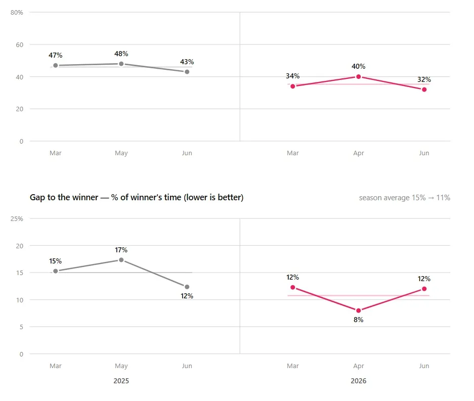
Tracking cycling progress: my race spreadsheet, 2025 vs 2026
One spreadsheet row per race — field position and gap to the winner. What two seasons of amateur MTB racing say about a year of structured training.

After every race I add one row to a spreadsheet. Date, race, category, finishing position, field size, my time, gap to the winner. I started it before Superfly existed, and I still keep it, because tracking cycling progress by feel does not work — memory flatters the good races and buries the bad ones. A spreadsheet does not negotiate.
This post is the spreadsheet, two seasons of it, and what changed between them.
Two numbers that survive different courses
Raw finishing position lies. Twelfth place means one thing in a field of 19 and another in a field of 38. Raw time lies harder — courses change, weather changes, one year the mud adds fifteen minutes. So the spreadsheet keeps two derived numbers instead:
- Position as a percentage of the field. Twelfth of 28 is 43%. It controls for how many people showed up, and it is the number my original “finish mid-pack” goal was written in.
- Gap to the winner as a percentage of the winner’s time. A 7-minute gap in a one-hour race is not the same as in a two-and-a-half-hour marathon. Dividing by the winner’s time makes races of different length comparable. Cross-country skiing has scored racers on exactly this percent-back logic for decades — the FIS points system is built on it.
Neither number is perfect. The field is not the same people every race, and the winner has bad days too. Over a season the noise averages out; over two seasons it becomes a trend you can trust.
What two seasons look like
Here is the raw data — every Karma Cup race I started, amateur group:
| Date | Race | Position | Field | % of field | Time | Gap to winner |
|---|---|---|---|---|---|---|
| 2025-03 | Rokanšikės | 17 | 36 | 47% | 1:29:21 | +11:50 |
| 2025-05 | Vanaginė | 10 | 21 | 48% | 1:43:31 | +15:18 |
| 2025-06 | Mozūriškės | 12 | 28 | 43% | 1:12:44 | +8:00 |
| 2025-07 | Tapeliai XC (stage 1) | 15 | 21 | 71% | 1:13:50 | +13:20 |
| 2025-07 | Tapeliai XCM (stage 2) | 13 | 24 | 54% | 2:31:35 | +20:55 |
| 2025-07 | Tapeliai overall | 13 | 26 | 50% | — | — |
| 2025-09 | Šernai | 12 | 19 | 63% | 1:42:15 | +15:46 |
| 2026-03 | Applinkelis | 13 | 38 | 34% | 1:06:21 | +7:15 |
| 2026-04 | Gudeliai | 10 | 25 | 40% | 1:05:51 | +4:52 |
| 2026-06 | Molynė | 7 | 22 | 32% | 1:02:52 | +6:44 |
And the comparable slice as a picture. The 2026 season is three races old, so the chart holds spring against spring and leaves 2025’s July–September races out of the averages:
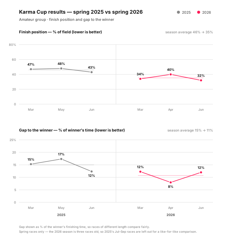
Spring against spring: average field position went from 46% to 35%, and the gap to the winner from 15% to 11% of the winner’s time. Even against the full 2025 season, every 2026 race so far has been better than every 2025 race on both measures. Molynė — 7th of 22 — is my first finish in the front third of the field.
The 71% at Tapeliai is worth keeping in the table rather than explaining away. It was the second-worst day of my 2025 season and it sat in the spreadsheet all winter. Bad rows are the reason the good rows mean something.
What changed between the seasons
Between the last row of 2025 and the first row of 2026 sits a winter of structured training: most of the volume below the first lactate threshold, controlled work just under the second, and none of the medium-hard grinding that used to fill my weeks. The full history of how I trained before — random all-out intervals, template plans, an AI experiment — is in my founder story. The short version: I did not train more this winter. I trained in the right places.
The number I watch between races
Races score me a handful of times a season. That is a slow feedback loop — six data points a year, weather included. The habit that replaced checking the spreadsheet weekly is checking my interval level in Superfly.
The interval progression works like levels in a game: complete a session consistently and the next one asks slightly more — more time just below threshold, less recovery between efforts — and eventually a new level unlocks. No heroic breakthrough sessions, just a counter that only moves when the body has actually adapted. Between races, that level number and the growing minutes near threshold are my progress bar. The spreadsheet confirms at race pace what the level already told me in training.
The old habit is not going anywhere, though. One row per race, no negotiation.
FAQ
How do you compare cycling race results across different courses?
Normalise them. Use finishing position as a percentage of the field to control for turnout, and the gap to the winner as a percentage of the winner’s time to control for course length and conditions. Absolute position and absolute time only compare cleanly when the course, weather, and start list are identical — which is never.
Is finishing position a good measure of cycling progress?
On its own, no — it depends on who shows up. As a percentage of the field, averaged over a season, it becomes useful. Pair it with a time-based measure like percent gap to the winner so a strong ride in a strong field does not read as a step backwards.
What should an amateur keep in a race results spreadsheet?
Date, race, category, position, field size, your time, and the winner’s time — everything else derives from those. Two computed columns do the real work: position ÷ field size, and gap ÷ winner’s time. One row per race, filled in the same day while the details are honest.
Why measure the gap to the winner as a percentage instead of minutes?
Because minutes scale with race duration. A 12-minute gap over a 2.5-hour marathon is a closer race than a 7-minute gap over one hour. Dividing the gap by the winner’s time removes that distortion and lets a short XC race and a long XCM marathon sit in the same trend line.
How do you see progress between races without doing FTP tests every month?
Watch what your training asks of you, not just your test numbers. In Superfly the interval level does this — sessions extend time near threshold and shorten recoveries only after the current dose is handled consistently, so the level itself is evidence of adaptation. A rising level between races predicts what the next spreadsheet row will say.